 |
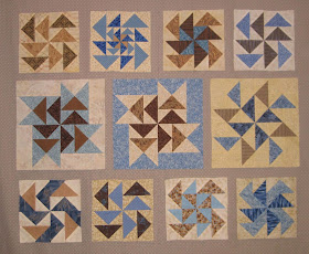
| Dutchman's Puzzle/Flying Dutchman block variations |
 |
| Vertical columns |
 |
| Horizontal rows (same photo as the first, but rotated 90 degrees) |
 |
| Diagonal setting of 12" blocks |
I'm linking up to Design Wall Monday at Small Quilts and Doll Quilts, Monday Making at Love Laugh Quilt, and Moving It Forward at Em's Scrapbag. I'm a day late, but I'm also linking up with Oh Scrap! at Quilting is more fun than Housework. Be sure to check out all of the wonderful projects that everyone is sharing!
Julie in GA
Yes, those decisions/or no decisions, will do it every time for me...Lots of boxes wriggling their covers "choose me, choose me"..They are really pretty blocks, but i can see what you say about the one with the blue background, too...hugs, Julierose
ReplyDeleteI love all the variations on the theme. I agree about the blue background dominating. Give it a center location? Make more? Give it its own quilt?
ReplyDeleteLove your Dutchmen's Puzzle blocks. They are a favorite of mine. Thanks for sharing with Moving it Forward!
ReplyDeleteLots of fun layout choices with those blocks. I like the one blue background, it draws your eye first, which might be OK if it's near the center of the quilt.
ReplyDeleteThere is something very classic about blue and brown together- really pretty blocks
ReplyDelete